Blink the Bee
Messenger Chatbot


Role:
Product Designer
Timeline:
Dec 2017 - Nov 2019
Tools:
Sketch, InVision, Chatfual
Tasks:
1. UX design for onboarding
2. UX strategy for improving retention
3. Conversation design
4. To-do list management design
5. Conducted users testing
Overview
I worked on the Blink project from 2017 to 2019. Team members including PM, engineers. My primary responsibilities were to improve product retention, include refining onboarding flow, conversation user interface(CUI) design, UX improvement, identify users' intention, and provide product strategy. Blink is launched in 2017, featured on Facebook messenger as one of the top chatbots with over 1M users. I helped improved product retention rate to 19% and Converted 22.9% of novice users into engaged users.
About
| Blink is a chatbot that helps users remember their to-dos.
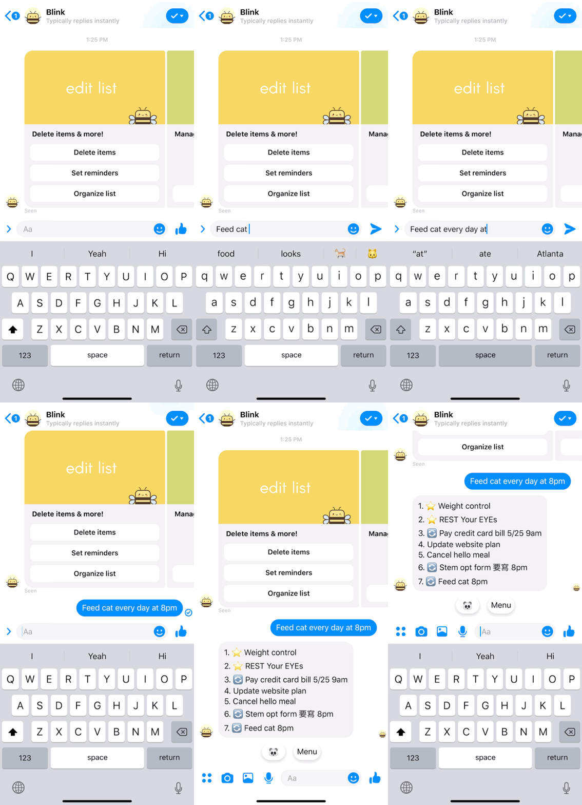
Blink is a productivity chatbot on Facebook Messenger that helps users remember their todos. Text Blink your todos so Blink can add them to your list, and remind you at the right time. It's mimicking the simple jot down interaction in our daily life, but instead, I am jotting down these todos to a chatbot. For example, Text "Feed cat every day at 8 pm", and Blink will add it to the list and send you a notification at 8pm.
What problem we are trying to solve?
| Blink is trying to help people remind their to-dos in an easy way.
Why?
People jot down to-dos, but they still forgot it. Under different situations and timing, people have different habits of jotting down to-dos. Some people will make a reminder on their phone, put it on the calendar, or just write it down somewhere. We also noticed some people text themselves things to remember it, but often they still forgot it. The reason can be because the to-do notes are all over the place and it’s hard to keep track of them. So we started to think, “What if... there’s an assistant can collect your to-do items and remind you at the right moment”
Interaction Design
Add list items
Reminders notification

Users jot down the to-dos and Blink will add it to their to-do list.
For example, users can type
"take out the garbage every Tuesday at 8am" Blink will add it to the list and send you a notification next Tuesday at 8am.

Users will get reminder notification when it's time for the task.
After getting the notification, users can mark it done, snooze or delete the tasks.
Delete items

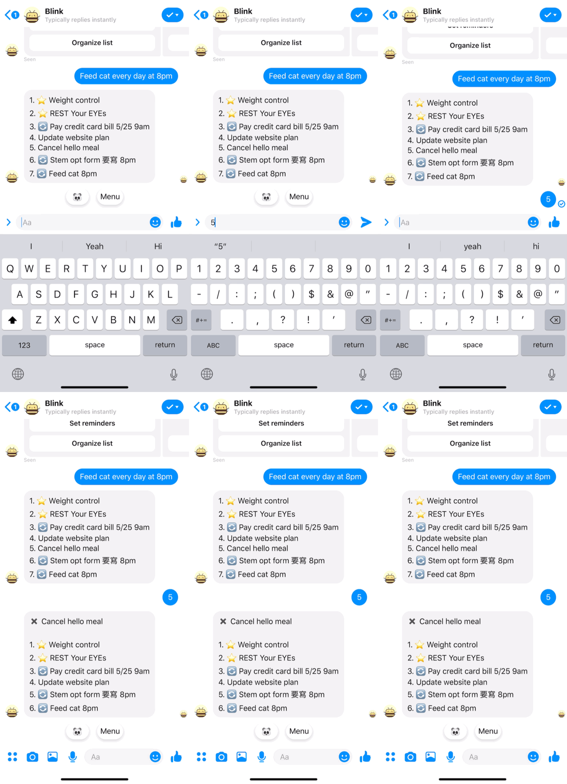
Users text the number to delete corresponded task.
It's an easy way to manage the list items, for example, texting 5 to Blink to delete the number 5 item on the list. Blink can also recognize more than one number at once.
Quick Reply

Quick reply help users move forward easily without typing.
Quick reply is good for providing inspiration for users at their first impression with the chatbot. Users tend to not knowing what to type, so we provide options for them to move forward. Besides that, I also add the quick reply design for snooze items.

Coversation User Interface(CUI) Design
Blink designed to be a virtual assistant on Messanger, helping users improve daily productivity, forming good habits, and remembering special events. To engage with our users Blink should have his/her personality. And this is how we describe Blink: Bright, peppy, reliable, organized, proud, tolerant, social-bee. In the early stage, Blink can greet, complete a simple conversation, and even tell bee-puns jokes. And based on the user feedback, users like the personality and engaging talking with Blink.

In-app web view design
Edit list remind time


Users can edit the time for sending list to you.
Users can set up multiple times to have Blink send the to-do list to remind you. By using the in-app web view, it provides flexibility in design. We are able to integrate some traditional UI that seems more straight forward for some users.
Challenges
| Hyber UI design challenge
There are multiple user interfaces use in Blink, including the conversation UI, Facebook chat UI (Quick replies, panel menu…etc.), and in-app web view. In the early design, Blink uses text commends as the main UI. When the product starts gaining more organic users, we face a low converting rate. I started my research and testing to define the problem. I found out that the majority of users still prefer button interaction. It’s straight forward and easy to understand. As a result, we gradually shift from text command to Facebook chat UI assets. By using the UI Facebook provided, we can provide a smoother experience. For example, using a quick reply to snooze or delete the reminder items is relatively intuitive than typing the command. We also adopted the in-app web view for our edit functions. In the previous system, users text Blink the keywords to edit the time, but it’s not easy for naive users to memorize commands. The web view design allows us to customize the UI and provide a better experience on complicated interaction.
| Improving retention
One of my main goals for Blink is to improve user retention. The first big challenge for me is to improve the drop off rate in the onboarding phase. One of the original designs for the onboarding steps has users type in "drink water" to move forward and the data shows that there's a big number of users drop off here. After I dived into the problem, I noticed that users are less willing to type in something in the early stage of using the product. I researched some popular apps and other productivity products' onboarding experience, noticed that the common design is through slides or buttons. I took the observation and start to think about how to eliminate the barrier for first-time users using a chatbot. I put together some designs using CUI plus Facebook chat UI combinations. And after testing out multiple ideas, we found out that Quick replies perform better in the experience. It interacted like a button but also carry the typing meaning. After implemented the solution the drop-off rate decreased from 50% to 30%.
Before
without Quick Reply

After
with Quick Reply
Add one more item


Set a time

| CUI design needs to handle small talks
The characteristics Blink carried make it approachable, and as a consequence, this causes distractions. Users attempted to chat with Blink and requested more bee-pun jokes. Although we loved to see the engagement happening but in the early stage of the product, Blink has not equipped to handle the various small talks. In the initial phase, Blink could not distinguish some to-do items and small talks, and it ended up confused users and added everything to the list, which is not an expected interaction for users. And the repeated conversations make Blink sounds like a can message robot.
To solve the problem, we came up with a new conversation system with the following goals:
-
Help users focus on finish their tasks, which is adding/edit list items.
-
Avoid frustration caused by unexpected interaction.
-
Build a chat flow system that is flexible for content management.
Below is the design process
#1 Data Analysis
Our data analyzing engineer dived into the conversation keywords pool, sorted out the most common messages, and breakdown them into several major categories:
• Popular intents: Greeting, Joke request, emoji
• Function requests
• List items
• The how-to questions
• Others intention

#2 UX Design for chatbot
I break down the user journey into two phases: the users exploring phase and the engaged phase. In the beginning, users tend to examine the product at their own pace, so my mission is to fulfill users’ expectations of the product while guide users to focus on the core function, which is adding list items and function requests. As a result, I designed different sets of responses, the good intents, product-related, and prompts for adding list items. In each group, there are general responses intended for the purposes. When Blink receives requests from users, Watson Ai will analyze and respond based on the intents category.
Users intent and response flow

Users journey map

#3 Outcome
The app rating on the FB messenger platform improved from 2.9 to 3.6. Users are more engaged with Blink and feel less frustration. We improved the product retention rate to 19% and Converted 22.9% of novice users into engaged users.
Retrospective
| Map out UX flow early
When I first onboarded this project, there wasn’t a clear map of Blink’s user experience flow. It took me a while to tidy up the flow and start making improvements. I think it’s vital to map out the UX flow, especially for a chatbot. It helps designers to understand better the structure of CUI and other chat UI elements. After mapping out the UX flow, I was able to see the product thoroughly and make decisions that have the most impact.
| Making a roadmap
Blink was my first project at Tang, so there was a learning curve for me to understand the working process there. After Blink launched, our users have increased dramatically, and the team is overwhelmed by all kinds of tasks coming through. We were in the fast turn-around mode to fix bugs and improve user experiences to meet the retention metric. Sometimes it feels like we are herds that have been chasing around by the shepherd. I think we can reduce the madness by mapping out a roadmap before the product launch, includes all the possible incidents and how to tackle it. By doing the road map, we can have an exact direction and do things organized.
Reflection
It's interesting to see people interact with a productivity chatbot like Blink. I've seen some users ask Blink for advice; people greet Blink as their friend and even curse Blink when they get annoyed. Giving Blink the ability to small talk is making the product much approachable. Meanwhile, we want the users to focus on the value that Blink provides, which is improving productivity and forming habits.
The other good thing about the new small talk system is that the structure became flexible, making it convenient for designers to swap out the content or expand in the future. As a user, I love Blink, and I often use it to remember my todos. As a designer, I saw a small chatbot transforming from a robot to a virtual assistant. Furthermore, Blink can create bonding with humans and create impacts on their life. It is amazing to see that happened.


