
WENHSIN | UX + Interaction Design


Role:
Product Designer (Collaborated with another designer)
Timeline:
2018 to 2019 (1yr)
Tasks:
1. Features improvement
2. Directed UX strategy
3. Prepared app for launch
4. Conducted users testing

About
Pitch Piano is an innovative app for piano learning. Instead of learning to play the piano from the traditional sheet music, we believe playing the piano should simple and easy. Our goal is to create a new method for anyone to play the piano anywhere. We created a new visual format for music reading, which uses tabs and keyboard shapes. Follow the dropping tabs to play a song, you can do it in a minute.
Who are our target users?
People who are interested in playing the piano;
People whom self identify as beginners or never played.
Overview
I worked with the Piano team from 2018 to 2019 as a Product Designer. My primary responsibilities were preparing the app for launch, which includes refining onboarding flow, UX research, identify product direction and designed new functions, in addition to making marketing material.
The app is launched in December 2019. Currently only available on iOS.
Redesign Onboarding Experience
While we know our product will compete in a crowded market space but we have confidence that our app can provide a huge impact on people who are interested in playing the piano but laking resources to learn from a piano teacher. In order to magnify the impact, we know the onboarding experience is taking a big role here.
So we examine the previous onboarding experience and came up with several ideas to make it perform better. The previous onboarding rate is about 12% and with the new design is implemented the result comes up to 30%, which is a significant improvement.
Situation:
After launched the app, our data indicated that we have 12% on-boarding rate.

The assumption is that users lost interests halfway when they clicked through the tutorial for the following reasons:
• Complicated tutorial flow.
• Too much information at once, instruction is vague and confusing.
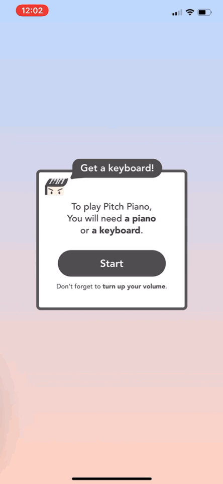
• The upfront payment wall is intimidating.
• Don’t have a piano keyboard at the side.

Research:
Methods: Survey, Online user testing, In-person testing, Competitive research.
I did user research to drive the planning phase by starting interviewing early on users. The goal was to understand their journey of playing a song on the piano using the new type of UI from their perspective, pain points, and the core value of the app.
Observation:
The existing tutorial has many steps and it's focused on app function navigation and encourages users to play the song. After finish the tutorial, 50% of testers understand the core value and would enjoy using it.

Key founding:
After couple testings, and accumulated feedbacks here’s what I observed.
• Learning each function limits the understanding of the whole product’s value.
• Tutorial length is long, compare to the current onboarding trends. Users tend to skip steps at the end.
• UI needs improvement for users to use and read from a ready position on piano.
• Pre-questions (introduce different mode) is confusing.
• Payment wall blocked users from moving forward.

Define Problem:
Information overloading on tutorial because of overestimating users' learning capability.
Examine: Why the onboarding rate is only 12%?
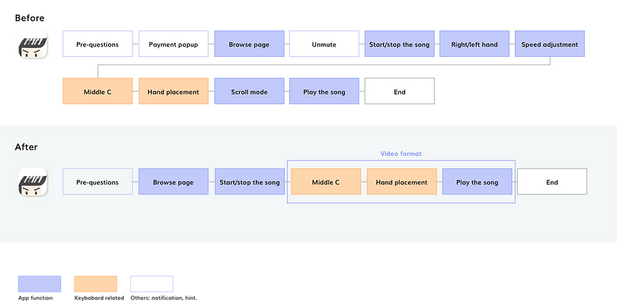
In my early hypothesis, I believe that by teaching each function and encourage playing a song during tutorial can help users get the core value. For the first design iteration, I tried to collect data that related to people’s process of learning piano, and asked users questions like, What is your preparation process look like before getting into playing the piano? What’s your current learning style? Based on the survey data collected, I designed the first approach which captured the essential preparation steps of piano learning( locate middle C, hand position, speed…etc) and some basic app functions. Even though the result is not satisfying, this whole process helps me lay the foundation for the next round iteration, with the knowledge I can make a better decision.


Examples for teaching users elementary piano knowledge, locate Middle C and hand placement.
Finding middle C and hand placement are important steps for our users to learn in order to move forward using our app. We use the song tab UI and real keyboard + hand picture to help our users mapping the app with a real keyboard.
My take away:
I noticed that there’re two important things here, learning app navigation & learning playing a song on the piano. Our first attempt is trying to provide them together, we try to teach users to play piano in the tutorial. But we learned that reality is harsh, learning an app can be easy, add another layer of learning to play a song is hard, it takes more efforts and create more frustration throughout the process for our users. Even though we believed that a hybrid type tutorial can be the right approach for our product, consider the current industry trends and our own time pressure, we need to make trade-off here.
To balance the information amount for learning the app and playing a song, we have to provide users the shortcut, which is an even shorter version tutorial.
Solution:
A shorten tutorial with few steps and only core value provided.
To shorten the upfront intro, I first went over the information we offered in the tutorial and reorganized the information architecture. We moved around some steps to make the experience fluent and excluded some over detailed steps (e.g. speed adjust, static mode, etc.)
Final Design:
Design Process:
The process was mainly around narrowing down the steps, identifying the information users need, and coordinating with PM to negotiate and prioritize the most feasible solution.
Knowing our goal is to shorten the steps while providing sufficient information for users to use the app. We know we need to focus on the core function of the app, “ Play your favorite song in a minute”. By eliminate steps and provide better understanding media, we are able to educate our users on the value of the app.
Based on our data from multiple testings and observations, here’s what we did:
• Redesigned UI for better navigation.
• Organized steps and information for better delivery jobs.
• Use videos instead of interactive interaction on the tutorial to decrease confusion and increase understanding.
• Remove upfront payment panel and a reminder to unmute the phone.
Result:
Within one month, we saw our onboarding completion rate increased from 12% to 30%. We also got an average 4.1 rating on the app store, 2.3% of subscription converting rate. Our next step is continuously improving the conversion rate and engaging our users.


